Saturday, June 29, 2013

Fifty {Two} Shades of Grey - Week 26

Half way through the year already...
And the last Christmas decoration until closer to Christmas...
I wasn't going to add this picture because it was just out of focus, but when I took a closer look, without meaning to, I managed to achieve a bokeh look that I really like.
And here is the in-focus, glittered bauble. Sweet, but I think I like the bokeh look better... what do you think?

Saturday, June 22, 2013

Fifty {Two} Shades of Grey - Week 25

I love Christmas... this is why I do my annual Christmas Craft Challenge after all... so I love Christmas decorations. I usually try to buy at least one new decoration each year and for the last three years has made several of my own as anyone who has followed my blog will well know.
This is a plastic filigree ornament that actually hangs from a string of plastic beads along with plastic filigree bells. I was surprised at the level of detail in the molding of these ornaments... that's an awful lot of dots! I have some individual filigree ornaments very similar to these that I adhered some bling onto to make them look a little more special. Just one way that you can personalised ornaments and make then look much more valuable, but for very little cost.
(Maybe I should add that to this year's Christmas Craft Challenge blog list!)

Tuesday, June 18, 2013

Art Journal Page - Be The Light

I did this page for a MOJO Challenge on Artistic Creationz Facebook Group. We could make whatever we wanted so long as it included the phrase "Be the Light".
I decided to make another art journal page, again using what I had learned from Donna Downey, but this time I did some extras on the page as well.
The finished page... "Be The Light".
Given the title, I knew before I started what image I wanted. I didn't know exactly how it would look, but I knew it would be some kind of candle.
I started with a background of warm acrylic paints - yellow, orange and red with white gesso. I drew the candles and flames in with charcoal pencil and then coloured the background with a cool palette of acrylic paints - light blue, dark blue, green, teal and purple, together with white gesso.
Once this was all dry I went over the charcoal lines with black Indian Ink, including adding some more detail to the candles for melted wax drips as well as the flames.
I wasn't happy with the colours of the flames, they didn't really look like flames. I added some water soluble oil pastels in white, yellow, mustard, orange, and red. I blended these with my Zig water brush and then my finger to get more the colouring I wanted but without hiding the underlying blending of the acrylic paints.
To darken the background so the "light" would stand out more, I stamped using a Glitz Distress Stamps - grid stamp and black acrylic paint dauber. I stamped by hand rather than using an acrylic block as this allowed me to stamp only in the areas I wanted around the candles and flames, rather than in distinct rectangles.
I added the title using some white glitter alphabets from Making Memories and highlighted these with some white acrylic paint. I was trying to have these quite an opaque white, but when it had dried the underlying colours had tinted the white a little and I do prefer this to the stark white.
Close up of the flames. The underlying striations in the acrylic paint show through really really well, particularly in the bottom of this uppermost flame.
This flames looks considerably brighter with the water soluble oil pastels added than they had looked with just the acrylic paints. 
I really like the way that some of the gesso appeared to have a "cracked" paint look in some places, as seen in this close up of one of the candles.
Close up of the grid stamped with the black acrylic paint, using the Glitz Distress Stamp. I also love the way this cool palette looks like paua (abalone) shell, particularly with the black highlighting.
You can see the underlying colours coming through the white "light beams".

Monday, June 17, 2013

Art Journal Page

I've finally been working on some more pages in my art journal. Here is the first page.
I used the techniques that I learnt from Donna Downey at Creative Adventures Downunder 2013, and repeated the exercises that we did in class, though this time I started with a cool palette of colours - light blue, dark blue, green and purple acrylic paints mixed with white gesso.
When I drew the image this time, I drew discrete images rather than one continuous line. I then coloured the background once again but this time with a warm palette of colours - yellow, orange, red and hot pink acrylic paints with white gesso.
When I went over the lines I had drawn with Indian Ink, I extended these inside the image to add additional dimension, then added texture to the image with fine detail lines. Doing this, brought back memories of being a teenager and doing many a pen and ink drawing for art class.
Close up of some of the detailing as well as the texturing of the background.


I really love the way the colours mixed yet still retained their vibrancy in this painting.
After I had finished my art page I created an extra background by swirling and dabbing the leftover paint onto another page. I REALLY love the way this background turned out and I will definitely be doing something more with it soon.

Sunday, June 16, 2013

Fancy A Cuppa?

Here's the second part of Mum's birthday present. I totally love this and very nearly kept it for myself.
I'd seen the lovely ladies on Artistic Creationz make these for a swap and I couldn't do it at the time they all made theirs, so I've just made mine (umm I mean Mum's) now.
I picked up the cup, saucer and plate set at the local Hospice shop for only $5.00 (Don't tell mum I only paid that much for it). I loved the colours and knew they were mum's favourites as well, so figured I was onto a winner. I altered the cup set into a pin cushion.


I half filled the cup with some hobby fill. I cut a circle from some leftover mauve satin I had in my stash, gathered this up and  filled it with more hobby fill. I adhered the satin "ball" in the top of the cup then glued a length of ribbon around the rim of the cup. I added a length of mauve crushed velvet ribbon around the back of the cup and then liberally covered the area with flowers from I Am Roses... which will be available through my shop. I really love the way the cup turned out... and so does Mum, though she did complain that when she finally got it the pins I had added for the photo where not included so I may need to raid my stash to keep her happy (as a good daughter would do :-).

Saturday, June 15, 2013

Fifty {Two} Shades of Grey - Week 24

Here in New Zealand, Christmas comes in the middle of Summer, so celebrating with all the trimmings of warm mittens, chestnuts roasting on an open fire, hot Egg Nog etc etc, really tend to get missed out, because lets be honest, it's usually just too darned hot.
I will admit though, and my family is no exception, that there are still a lot who celebrate with some traditions, like a hot roast meal for Christmas lunch. (Though some also prefer a nice salad with selection of cold meats).
Anyway... over the last few years, there has developed quite a tradition of celebrating a mid-Winter Christmas here in New Zealand, with the more traditional trappings of the Winter period, even though not all of us get snow in Winter.
So in honour of a mid-Winter Christmas I wanted to share some grey/silver Christmas decorations.

Christmas wouldn't be Christmas without tinsel! Say no more!!

Friday, June 14, 2013

Birthday Book

I've had this project finished for a while now, but couldn't post the pictures as it was my Mother's birthday gift and I couldn't be sure whether or not she would see it. I finally gave Mum her belated birthday present last night (only a month and a bit late). She would have received it earlier but they've been telling us for three month that they were coming up to Auckland (from their home the other end of the country) and only just made it now.
I decided to make a couple of presents so will share them with you. Be sure to come back tomorrow to see the second part other present.
Mum asked for a book to record the family's birthdays in. (Yes she needed it as she keeps forgetting when the kids' birthdays are). The only condition was that I had to include everyone's birthdays BEFORE I gave it to her.
I made the cover from chipboard and covered it with patterned paper from the KaiserCraft "Magic Happens" paper pack. I added some ribbon to decorate the covers as well as a ribbon closure. 
I adhered a beaded flower stem I made onto the front to add a little blingy decoration and finished it all off with a glitter alphabet title... a woman can never have enough bling!!
I had to include this picture as it took me so many attempts to get the glittery look!!
The pages are made from C4 envelopes which I trimmed down to 6" (only about 1/4" chopped off). I then covered each side of the envelope with a selection of patterned papers from the pack which I had distressed the edges using Tim Holtz Distress Inks - Walnut Ink. The pages were adhered into the cover using structure strips as a flexible spine.
I cut a semi-circle pull tab in the top of each envelope to make getting the birthday list for each month out of it's respective envelope. I added a small journal block onto the front of each envelope that I had stamped with the month.
I cut cardstock to a size that would fit inside each envelope then printed onto both sides of the card the days of the month for the birthdays to be entered into. I finished these off with a corner punch before stamping a matching month name.

Sunday, June 9, 2013

YouTube Videos... Making My Online Presence Felt

I'm in the process of trialing different camera locations for recording videos. I still don't have it perfected but I'm making progress all be it not as fast as I would like.
I still need to make sure I keep the tripod legs out of the picture... and remember to check no odd bits and pieces make it into the shot (doh... shoulda' checked that!!) and sort out the lighting and sound quality and... and... and...
Okay so maybe I'm being a little bit of my perfectionist self and maybe I should just put them out there to build up a following and work to keep improving instead of demanding perfection of myself from the start. After all everyone has to start somewhere and isn't learning part of the process... don't I sound like a therapist's dream patient LOL.
So here are links to the latest couple of videos I have posted:
Happy Mail - A video of the prize I won from Heartfelt Creations in the competition they ran on Facebook
Structure Strips Storage - A video of a construction project I made using what I had learnt from Jim the Gentleman Crafter at TheGentlemanCrafter channel and Laura at FollowThePaperTrail channel.
I hope you enjoy these videos. Be sure to subscribe to my channel so you can be updated whenever I add a new video... and there will be a few new ones added soon.

Saturday, June 8, 2013

Fifty {Two} Shades of Grey - Week 23

Last one I promise... and to finish on a positive note...

It's the positive end of the charger. It wasn't until I photographed this, that I realised these were ridged like this. Who knew??

Friday, June 7, 2013

Swap - Mixed Media Postcards

The second swap for the month were mixed media postcards, and having just done the class with Donna Downey at Creative Adventures Downunder, I was really keen to try some of the techniques we had learned from Donna at home on my own. (Let's be honest to see if I had actually paid attention!!)

The postcards had to be 4" x 6" and because they were mixed media designs, I wanted a bit more strength to the base of the postcard so I recycled some cardboard boxes for each postcard. 
I painted each side of the postcard base with a couple of layers of gesso to hide the print on one side and provide a even coat on the other side. 
I added some flowers using a template from The Crafters Workshop with some Texture Paste over a portion of the front of the postcard. Once the texture paste had completely dried, I misted the entire front of each postcard with a different colour. Some were Tattered Angels Glimmer Mists and others were Heidi Swapp Color Shine Mist.
In the top right corner I added some layered flowers. I started with half of a large white fabric flower which I folded in half (so it was the equivalent of a quarter flower). I then layered half a batik paper flower (I only had three flowers, so I was clutching at straws and making do so I used what was in my stash). I then added a full white paper flower and top the stack off with some bling which were the only things I did buy (and they were from the discount store.)
On the left I layered a strip of antique embroidered lace which I picked up at the local hospice shop - definitely a bargain buy!!!
I traced around the frame of the heart from the Heidi Swapp Clear Pop Tags we received at Creative Adventures Downunder. We had used the heart in one of Heidi's projects that we created, but I really liked the shape of it, so I used the leftovers as a template to draw the hearts. I once again used recycled cardboard packaging for the hearts. I coloured each heart randomly using a warm colour palette from my Crayola Water Soluble Oil Pastels. (Yes I'm making sure I get plenty of use from them after I invested in them). I blended them with some spritzed water.
I misted over the top using a KaiserCraft stencil with Mr Hueys Mist - white and Tattered Angels Glimmer Mist - Pearl. 
And then everything went wrong...
I wanted to protect the stencil so it wouldn't rub off or smudge so I painted on a thin coat of gloss varnish... however, instead of protecting the stenciled image it just blurred everything and turned it into a white wash. I still liked the end result so didn't scrap it but decided to work with what I had.
I stamped randomly some script images from one of the Glitz Distress Stamps in Archival Ink - Coffee.
To finish off the hearts I wrapped some lurex embroidery threads in red, hot pink and silver randomly across the surface of the hearts. Then I randomly added some pearl bling to secure the threads in place... more as a security precaution, but I love the end result!!
The finished hearts were then attached in place on top of the antique lace.
I have a postcard stamp but it wasn't big enough to cover the back of the postcard and to be honest would have looked silly stamped on the back as it was. I loved the style of the word "Postcard" so I masked this off before inking it and stamping it onto the centre back of each postcard. I then used the same ink and with my water brush drew each of the lines on the back of the postcard by hand. (Something I will never be doing again!!!)
Front and back of the postcards. 
I really enjoyed making these mixed media postcards and I love the end results... very me with the lovely bright colours. The hardest part was trying to decide which one I wanted to keep for myself!!

Thursday, June 6, 2013

Swap - Inchies Set

Quick share on one of the swaps I've just posted away for Artistic Creationz Online Group. This month I participated in two swaps, the first I have done for a few months.

This swap was for a set of three coordinated inchies. The theme was open, but we had to use cream, red and black, any, some or all of these colours.

These were my first inchies, I've ever made, so it was really interesting on how to make them. I ended up cutting patterned paper 2" square. Stamped and heat embossed the images with fine black embossing powder. Once there were all done I then coloured a portion of each of the three designs using my Crayola Water Soluble Oil Pastels - two shades of red.

While the pastels had set, I cut recycled cardboard into 1" squares then ran these through my Xyron 150. I adhered these into the middle of each of the embossed patterned paper squares. I mitred each corner then wrapped the edged over onto the back of the cardboard squares. This also had the added benefit I hadn't thought about of giving the inchies dimension when they were attached to the tag.

I cut rectangles of black cardstock 2" x 5.5" (from memory) then rounded the corners with a Fiskers shaped corner punch. I cut some cream ribbon and created a loop at one end and a "V" at the other so the ribbon wouldn't unravel. I then adhered this down the middle of the cardstock tag. To finish off, I attached one of each design of the inchies evenly down the length of the tag. (I just used a single photo slit so that hopefully if the other participants wanted to remove them and use them on another project, this should be easy enough to do.)

We only had to make five sets, but I made a couple of extras. 
 I really like the way these turned out.
The inchies in detail. I purposely chose images that were larger than 1" so they would wrap over the edge of the inchie. Just random stamps that had a strong line image for the heat embossing.


Monday, June 3, 2013

Creative Adventures Downunder - Part 6 (Final)

The final US tutor we were blessed to spend time with was the incredibly talented, perpetually positive and all around nice lady - Donna Downey. We had one class with Donna, over either two or three sessions depending upon which group you were with. The Pink group were the last ones to get down and dirty with Donna's unique "hands-on" style of teaching.
This was the class I was both most looking forward to and most nervous about. Unlike many scrappers and crafters, my own exploration of mixed media crafting and art journaling had, until this class, been little more than dipping a toe in the water, so to speak. I knew who Donna was, had seen some of her videos and tutorials and knew a little bit about her product range, but boy was this class an eye opener!
I was pre-warned from people in the other classes that it didn't matter where we sat as Donna was a move about the class room kind of teacher... a plus in my book. So with all my goodies on my desk I sat patiently waiting for all the fun to start.
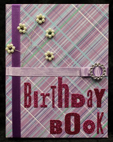
The first thing we had to do was pick one of Donna's signature journals to create in. These have a fabric and canvas cover, hand sewn, with the hugest big button on the front and an elastic closure to hold it all together.
The signature inside (the pages to us newbies) were a mix of Bazzill cardstock cut to size inter-mixed with tags and envelopes. All of this is held together with a coordinating ribbon threaded through some grommets in the spine. I fell in love with these lime green dots the moment I saw them. (It helped it was the only one of its kind left in the box as well!)
Opened up, these are what all the pages looked like. The Bazzill cardstock is all pre-cut to 12" x 9", so when folded in half the album size is 6" wide and 9" tall.
The first two pages we created were to compare the results of Faber Castell Gelatos on backgrounds with and without gesso. We had to chose either a warm or cool colour palette and use 2 or 3 colours from that palette to experiment with how they blended differently on the background as well. We coloured the two pages with the various shades of gelatos, then spritzed with water and blended with our fingers... time to get dirty!!
This page didn't have any gesso on it. It really soaked up the gelatos and water mix so gave a more subtle and even blending of the different tones of colour. However in doing this I found that I had to be careful not to over blend the colours as then the paper itself seemed to separate and bits were coming off into the colour mixing which I then had to remove. Of course this may have been because it was the back side of the paper as well.
This page had been coasted with the gesso. This time the gelatos felt like they skimmed across the surface of the page rather than soaking into it. This meant they also maintained their individual colours more and didn't blend as well (or as subtly) as when used on the non-gessoed paper.
The second step was to compare the difference between gesso and non-gessoed backgrounds when painted with acrylic paint. Again we had to use 2 or 3 warm or cool paints and blend them together. The above is without gesso. I did noticed the paints looked a little flatter on the non-gessoed paper than on the background that was gessoed.
This is with the gesso on the background paper. Of all the exercises this was the one I didn't really get or see any difference. I'm not sure if it was because I just didn't get it, or because the acrylic paints I used were cheap craft quality and not a good quality artist acrylic paint.
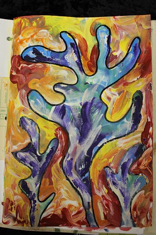
This was the next page we did. Finger painting!! Such a revelation, it was like being a kid again!
This time was finger painting with acrylic paints. We had to pick either a warm or cold palette once again. This time I went with a cold palette using light blue, green and purple together with white. Using our fingers only (quite liberating I might add), we covered the entire background page. The emphasis this time was on blending the colours to create new colours and new tones as well as a texture though the technique.
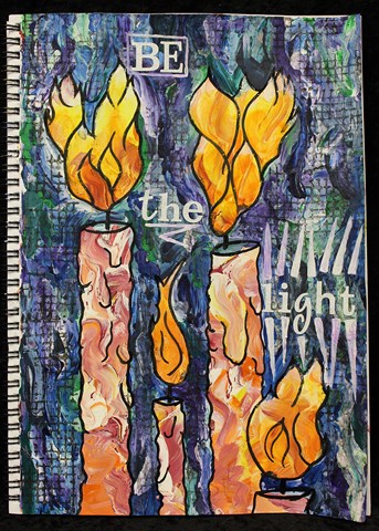
Once this layer was dry we then drew a shape or image using a 6B charcoal pencil. From the cool coloured background I had painted I could see almost like a underwater scene, so this provided the inspiration for my image. I drew some (very) abstract coral. Around the coral images I then finger painted over the top using the same technique but this time using a warm palette.
The final step (to get to this stage) was to go over the drawn lines once the paint had dried, though instead of using the charcoal pencil again, I used Indian Ink. I still haven't decided if I am going to do any more to this page or not. Part of me is saying yes it needs more, but I also really love the colours just the way they are.
The next page we did we adhered a canvas heart onto one of the pages then coloured it one colour with acrylic paint (either light or dark) and the background another colour, the opposite of what we had used for the heart. If the heart was a dark colour, then the background was light. I of course did the other, which was the harder combination for the next step... typical!!
This exercise was about how to add depth and shading/shadowing to give a three dimensional look to an image/item. Over the top of the painted areas around the inside of the heart (and outside of the heart on the background) we added the Crayola Water Soluble Oil Pastels which we blended together with a spritzing of water.
I really like the way that the texture of the canvas and the background cardstock show through the colouring and shading. I still want to work on the shading a bit, but I'm sure this will continue to develop with time.
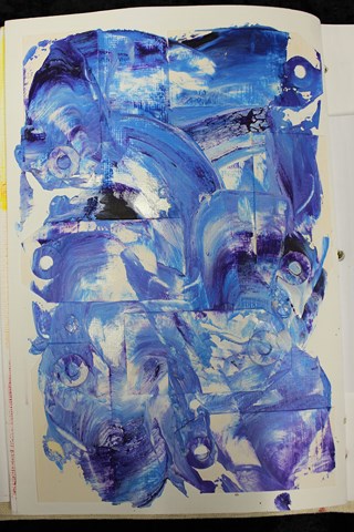
The next exercise was to adhere some mini tags to a page. The entire page was then covered in gesso. Once this was dry we then added some blobs of paint across the page before smearing them over the page using a palette knife to highlight the texture of the background.
We then had to adhere down some string to a page and cover this in gesso as well. To add even more texture, I tied small knots along the length of the string as well. I adhered the string on both a full page as well as one of the tags (half an envelope) between two pages.
We covered each page using the finger painting method used earlier on and then highlighted the texture of the string using a complementary colour (i.e. opposite it in the colour wheel). We also used the palette knife to add some scrapes of colour around the edge of the page.
The final step was to attempt to add some additional texture using an image transfer technique to copy the text from a page of text from a book. I used a matte gel that Donna hadn't tried before, so the unsure result was untested as to whether or not it would work. Donna explained two techniques, so I gave them both a go to see which would work best. One worked... the other didn't, though even the one that worked still needs some refining.
Here is a bit more of a close-up of the image transfer. There is still the look of the paper in the image hence the need to work on this technique a bit more but I still like the way it has come out.
The final technique we tried was to stamp using one of Donna's signature stamps using the gelatos. I' stamped my image onto the inside back canvas cover of my journal. I think the key is to be VERY generous with the colour on the stamp and spritz it with water, but then having done that, you can then stamp multiple images without having to refresh the colour.
This particular class was the one that I had to buy the most new products for and I think the class that had the longest bring to class list. I know for some this was an issue (there were one or two quite vocal about it), but these did tend to be the people who felt the least comfortable about the class content. I had no problem at all buying these products and I know I will continue to use them again and again... I already have used them again.
By the end of the class I think I could safely speculate that the people in the class were polarised into one of two extremes - they either totally loved the class and couldn't wait to try more mixed media creativity or they really didn't like it and intended to never try anything like this again. I'm the type of person who believes  don't knock something until you have tried it as you never know if you will like something or not until you have actually tried it. I can safely say that thanks to the terrific teaching of the lovely Donna Downey, I am definitely a convert and I will be trying more very soon!
I had to do the obligatory photo with Donna, but to be different I wanted to take a "Dirty Hands" picture even though our hands weren't that dirty as we had both cleaned them during the class (several times). 
Thank you so much for the wonderful class Donna!!